Designing a Scalable App-Wide Theming System in SwiftUI
Theming is one of those features users notice instantly — and one of the easiest places to introduce inconsistency if it’s not designed carefully.
In my invocing app Reckord, users can choose an app theme directly from Settings. Once changed, that theme needs to apply everywhere: text, backgrounds, surfaces, outlines — instantly and consistently.
SwiftUI gives us powerful tools to solve this cleanly. Instead of passing theme objects through view initializers or relying on global singletons, Reckord uses a SwiftUI-native, environment-driven approach, backed by a token-based design system.
This article walks through the exact implementation used in Reckord, while also highlighting which parts are implementation choices, not hard requirements.
Goals of the Theming System
- A single source of truth for UI styling
- App-wide access without prop drilling
- Instant UI updates when the user changes theme
- First-class support for System Light/Dark Mode
- A foundation that can expand beyond colors
The last point is important: this system is intentionally abstract. It is designed to grow into fonts, spacing, corner radius, and other design tokens — not just colors.
High-Level Architecture
SwiftUI View
   ↓
EnvironmentValues.theme
   ↓
Theme abstraction
   ↓
Design tokens (colors, fonts, spacing…)
   ↓
User-selected theme (persisted)
Views never know:
- where the theme comes from
- how it’s stored
- which implementation is used under the hood
They only consume semantic values.
Understanding SwiftUI Environment
Apple uses it internally for:
- color scheme
- dynamic type size
- locale
- accessibility settings
We can extend the same mechanism for app-wide theming.
Before diving into the implementation, it’s important to understand the two building blocks that make this possible:
EnvironmentKey and EnvironmentValues.
What Is EnvironmentKey?
An EnvironmentKey defines a custom value that can live inside SwiftUI’s environment.
struct ThemeEnvKey: EnvironmentKey {
    static let defaultValue: ThemeToken = AppTheme()
}

class AppTheme: ThemeToken {
    let spacing = SpacingTokens()
    let colors = ColorTokens()
}
This does two things:
- Declares the type of value stored in the environment
- Provides a default value so views never crash due to missing data
SwiftUI uses this default unless the value is overridden higher in the view hierarchy.
What Is EnvironmentValues?
EnvironmentValues is a type-safe container that SwiftUI uses to store environment data.
We extend it to expose a clean API:
extension EnvironmentValues {
    var theme: ThemeToken {
        get { self[ThemeEnvKey.self] }
        set { self[ThemeEnvKey.self] = newValue }
    }
}
After this, theme behaves just like a built-in SwiftUI environment value.
Reading from the Environment
Any SwiftUI view can now access the theme like this:
@Environment(\.theme) private var themeSwiftUI automatically re-renders the view whenever the theme changes — no manual observation required.
Defining a Theme Abstraction
The ThemeToken protocol defines what a theme provides, not how it is implemented.
protocol ThemeToken {
    var colors: ColorTokens { get }
    var spacing: SpacingTokens { get }
}
This abstraction is intentional.
Later, this can evolve into:
protocol ThemeToken {
    var colors: ColorTokens { get }
    var spacing: SpacingTokens { get }
    var typography: TypographyTokens { get }
    var radius: RadiusTokens { get }
}
Nothing in the view layer would need to change.
Centralizing Styling with Design Tokens
All UI styling in Reckord flows through semantic tokens, not raw values.
For colors, this is done using ColorTokens.
Instead of scattering Color(...) throughout the app, every color flows through semantic properties such as:
foregroundPrimarybackgroundSecondarysurfacePrimaryoutlineTertiary
Example: Colors
struct ColorTokens {
    @Shared(.currentTheme) var currentTheme

    // MARK: - Foreground colors

    /// Used for primary text, selected icons, etc.
    public var foregroundPrimary: Color {
        if currentTheme == .system {
            Color(uiColor: .label)
        } else {
            currentTheme.color.foregroundPrimary
        }
    }

    /// Used for secondary text like subtitles, unselected icons, etc.
    public var foregroundSecondary: Color {
        if currentTheme == .system {
            Color(uiColor: .secondaryLabel)
        } else {
            currentTheme.color.foregroundSecondary
        }
    }

    /// Used for tertiary text like placeholders, disabled icons, etc.
    public var foregroundTertiary: Color {
        if currentTheme == .system {
            Color(uiColor: .secondaryLabel)
        } else {
            currentTheme.color.foregroundTertiary
        }
    }

    /// Used for placeholder text like placeholders in text fileds and text views etc.
    public var foregroundPlaceholder: Color {
        if currentTheme == .system {
            Color(uiColor: .placeholderText)
        } else {
            currentTheme.color.foregroundTertiary
        }
    }

    // MARK: - Inverted colors

    /// Used for primary text on inverted backgrounds, selected icons, etc.
    public var invertedForegroundPrimary: Color {
        if currentTheme == .system {
            Color(uiColor: .white)
        } else {
            currentTheme.color.invertedForegroundPrimary
        }
    }

    /// Used for secondary text on inverted backgrounds, unselected icons, etc.
    public var invertedForegroundSecondary: Color {
        currentTheme.color.invertedForegroundSecondary
    }

    /// Used for tertiary text on inverted backgrounds, disabled icons, etc.
    public var invertedForegroundTertiary: Color {
        currentTheme.color.invertedForegroundTertiary
    }

    // MARK: - Background colors

    /// Used for main content background, app background, etc.
    public var backgroundPrimary: Color {
        if currentTheme == .system {
            Color(uiColor: .systemGroupedBackground)
        } else {
            currentTheme.color.backgroundPrimary
        }
    }

    /// Used for secondary backgrounds, cards, etc.
    public var backgroundSecondary: Color {
        if currentTheme == .system {
            Color(uiColor: .secondarySystemGroupedBackground)
        } else {
            currentTheme.color.backgroundSecondary
        }
    }

    /// Used for tertiary backgrounds, inactive buttons, etc.
    public var backgroundTertiary: Color {
        if currentTheme == .system {
            Color(uiColor: .tertiarySystemBackground)
        } else {
            currentTheme.color.backgroundTertiary
        }
    }

    // MARK: - Surface colors

    /// Used for surfaces with opacity. Cards, pills, etc.
    public var surfacePrimary: Color {
        currentTheme.color.surfacePrimary
    }

    /// Used for secondary surfaces with opacity. Scrims, overlays, tooltips, etc.
    public var surfaceSecondary: Color {
        currentTheme.color.surfaceSecondary
    }

    /// Used for tertiary surfaces with opacity. Tooltips, popovers, etc.
    public var surfaceTertiary: Color {
        currentTheme.color.surfaceTertiary
    }

    // MARK: - Inverted surface colors

    /// Used for elements that need dark backgrounds, like cards, sheets, etc.
    public var invertedSurfacePrimary: Color {
        currentTheme.color.invertedSurfacePrimary
    }

    /// Used for elements that need slightly less darker backgrounds, like panels, dialogs, etc.
    public var invertedSurfaceSecondary: Color {
        currentTheme.color.invertedSurfaceSecondary
    }

    // MARK: - Inverted background colors

    /// Used for main content background on dark backgrounds, app background, etc.
    public var invertedBackgroundPrimary: Color {
        currentTheme.color.invertedBackgroundPrimary
    }

    /// Used for secondary content background on dark backgrounds, card background, etc.
    public var invertedBackgroundSecondary: Color {
        currentTheme.color.invertedBackgroundSecondary
    }

    /// Used for tertiary content background on dark backgrounds, modal background, etc.
    public var invertedBackgroundTertiary: Color {
        if currentTheme == .system {
            Color(uiColor: .systemBlue)
        } else {
            currentTheme.color.invertedBackgroundTertiary
        }
    }

    // MARK: - Outline colors

    /// Used for primary outlines, borders, etc.
    public var outlinePrimary: Color {
        currentTheme.color.outlinePrimary
    }

    /// Used for secondary outlines, borders, etc.
    public var outlineSecondary: Color {
        currentTheme.color.outlineSecondary
    }

    /// Used for tertiary outlines, borders, etc.
    public var outlineTertiary: Color {
        currentTheme.color.outlineTertiary
    }
}
Example: Spacing
struct SpacingTokens {
    ///2
    public let xxxs: CGFloat =  2

    ///4
    public let xxs: CGFloat = 4

    ///8
    public let xs: CGFloat = 8

    ///12
    public let sm: CGFloat = 12

    ///16
    public let md: CGFloat = 16

    ///24
    public let lg: CGFloat = 24

    ///32
    public let xl: CGFloat = 32

    ///48
    public let xxl: CGFloat = 48

    ///64
    public let xxxl: CGFloat = 64
}
This ensures:
- consistent usage across the app
- easy refactoring
- readable UI code
Modeling Theme Choices with Theme
Users can choose from the following themes in Reckord:
- System
- Graphite
- Sky
- Tomato
- Gold
- Grass
- Ruby
These options are modeled using a strongly typed enum:
enum Theme: String, CaseIterable {
    case system = "System"
    case graphite = "Graphite"
    case sky = "Sky"
    case tomato = "Tomato"
    case gold = "Gold"
    case grass = "Grass"
    case ruby = "Ruby"

    var color: LCHColor {
        switch self {
        case .system:
            return Color.proBlue
        case .graphite:
            return Color.proGray
        case .sky:
            return Color.proSky
        case .tomato:
            return Color.proTomato
        case .gold:
            return Color.proGold
        case .grass:
            return Color.proGrass
        case .ruby:
            return Color.proRuby
        }
    }
}
Why an Enum?
Using an enum provides:
- Compile-time safety
- Easy iteration for Settings UI
- Clean persistence using raw values
- A single source of truth for available themes
Mapping Themes to Color Palettes
In Reckord, each Theme maps to an LCHColor palette:
var color: LCHColorThese palettes are sourced from ColorTokensKit-Swift, a library created by the talented designer Siddhant Mehta, offering:
- LCH-based color tokens
- Built-in Light/Dark Mode handling
- Perceptually balanced color values
👉 https://github.com/metasidd/ColorTokensKit-Swift
NOTE
ColorTokensKit is not required for this system.
You can replace it with:
- system colors
- custom Color values
- asset catalog colors
- your own token structs
The system does not depend on any specific color library — only on the idea of semantic color tokens.
Persisting the Selected Theme
In Reckord, the selected theme is persisted using Point-Free’s Sharing library, backed by UserDefaults.
extension SharedKey where Self == AppStorageKey<Theme>.Default {
    static var currentTheme: Self {
        Self[.appStorage("currentTheme"), default: .system]
    }
}
👉 https://github.com/pointfreeco/swift-sharing
This gives:
- persistence across launches
- reactive updates
- type safety
NOTE
Using the Sharing library is optional.
You can implement the same system using:
@AppStorage- a custom observable state
- any persistence layer
What matters is that the selected theme is reactive, not how it’s stored.
Using the Theme in Views
From a view’s perspective, theming is intentionally simple:
struct InvoiceRow: View {
    @Environment(\.theme) private var theme

    var body: some View {
        VStack(spacing: theme.spacing.xs) {
            Text("Invoice #1024")
                .bold()
                .foregroundStyle(theme.colors.foregroundPrimary)

            Text("Paid")
                .font(.caption)
                .foregroundStyle(theme.colors.foregroundSecondary)
        }
    }
}
Views don’t care:
- how the theme is stored
- which library is used
- whether it’s system or custom
They only care about meaningful tokens.
Visual Result
Below are screenshots from Reckord app showing different themes applied to the same screens:
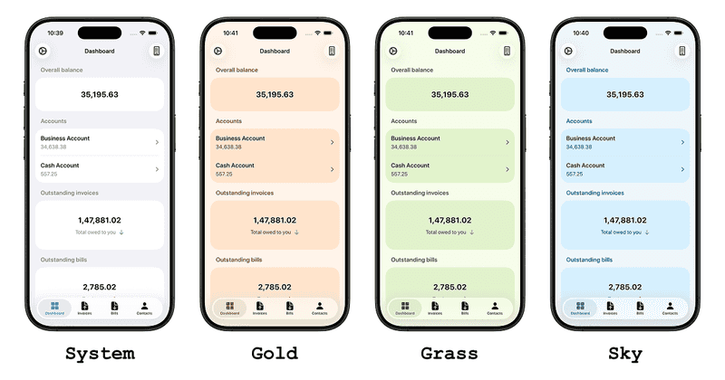
Theme changes apply instantly and consistently across the app.
Final Thoughts
SwiftUI’s environment system is a powerful but often underused tool for app-wide concerns like theming.
By combining:
EnvironmentKeyandEnvironmentValues- an abstract theme model
- semantic design tokens
- reactive persistence
Reckord achieves a theming system that is:
- Declarative
- Flexible
- Library-agnostic
- Easy to evolve
Whether you use ColorTokensKit, system colors, or your own palette, this system gives you room to grow — from colors and spacings today to a full design system tomorrow.
Thank you for reading. If you have any suggestions or a better approach, feel free to connect with me on X and send me a DM. If you enjoyed this article and would like to support me, Buy me a coffee.