SwiftUI Fonts Explained - System Styles, Modifiers and Accessibility
Fonts define the visual structure and readability of text in a SwiftUI interface. SwiftUI provides a typography system that adapts automatically to user settings, supports accessibility, and maintains consistency across Apple platforms.
This blog describes how to use system font styles, apply font modifiers, and integrate custom fonts in SwiftUI.
Why Fonts Matter in UI/UX
Fonts influence how users scan, read, and understand information in your app.
Good typography helps with:
- Establishing visual hierarchy
- Improving readability
- Creating a consistent brand identity
- Supporting accessibility features like Dynamic Type
SwiftUI encourages the use of semantic font styles instead of fixed font sizes. Semantic styles adapt to:
- Dynamic Type
- Accessibility settings
- Platform-specific typography guidelines
Using System Font Styles
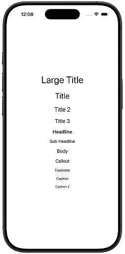
System font styles describe the purpose of text rather than its size. SwiftUI adjusts the actual font size automatically.
Example
VStack(spacing: 12) {
    Text("Large Title")
        .font(.largeTitle)

    Text("Title")
        .font(.title)

    Text("Title 2")
        .font(.title2) //available in iOS 14 and onwards

    Text("Title 3")
        .font(.title3) //available in iOS 14 and onwards

    Text("Headline")
        .font(.headline)

    Text("Sub Headline")
        .font(.subheadline)

    Text("Body")
        .font(.body) // default

    Text("Callout")
        .font(.callout)

    Text("Footnote")
        .font(.footnote)

    Text("Caption")
        .font(.caption)

    Text("Caption 2")
        .font(.caption2) //available in iOS 14 and onwards
}
Output
- Use
.largeTitlefor main screen titles. - Use
.title,.title2,.title3for primary section titles. - Use
.headlinefor emphasized labels. - Use
.subheadlinefor secondary headings. - Use
.bodyuse for readable body text. - Use
.calloutfor quote, important information, or a benefit statement. - Use
.footnotefor secondary text, such as disclaimers, or legal information - Use
.captionfor small, secondary text such as descriptions accompanying images, disclaimers, or subtitles. - Use
.caption2for alternate, smaller captions.
All system styles automatically support Dynamic Type it means these styles scale automatically when users change text size in Settings.
Applying Font Weight
Font weight determines the thickness of characters, ranging from very light to very heavy. Use it to establish hierarchy without changing font size.
Example
VStack(spacing: 12) {
    Text("Ultra Light")
        .fontWeight(.ultraLight)

    Text("Thin")
        .fontWeight(.thin)

    Text("Light")
        .fontWeight(.light)

    Text("Regular")
        .fontWeight(.regular)

    Text("Medium")
        .fontWeight(.medium)

    Text("Semi Bold")
        .fontWeight(.semibold)

    Text("Bold")
        .fontWeight(.bold)

    Text("Heavy")
        .fontWeight(.heavy)

    Text("Black")
        .fontWeight(.black)

}
.font(.title)
Output
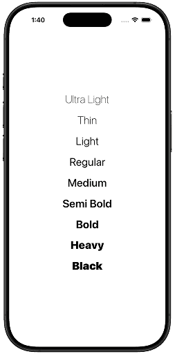
- Use
.regularfor body text - Use
.mediumor.semiboldfor labels - Use
.boldor.heavysparingly for emphasis
Combining Font Style and Weight (Best Practice)
Instead of using only weight or size, combine font style + weight.
Example
VStack(spacing: 12) {
    Text("Invoices")
        .font(.title)        // title font style
        .fontWeight(.heavy)  // heavy weight

    Text("Invoice Summary")
        .font(.headline)        // headline font style
        .fontWeight(.semibold)  // semibold weight
}
Output
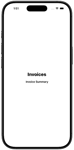
Why this works
- Keeps typography adaptive
- Maintains Apple’s visual consistency
- Works perfectly with accessibility
Font Design
SwiftUI allows you to change the design of system fonts.
Available Designs
.default.rounded.monospaced.serif
Example
VStack(spacing: 12) {
    Text("Default Design")
        .font(.title)

    Text("Rounded Design")
        .font(.title)
        .fontDesign(.rounded)

    Text("Monospaced Design")
        .font(.title)
        .fontDesign(.monospaced)

    Text("Serif Design")
        .font(.title)
        .fontDesign(.serif)
}
Output
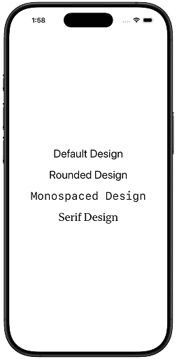
Use Cases
- Monospaced - Numbers, invoices, codes
- Rounded - Friendly UI
- Serif - Reading-heavy apps
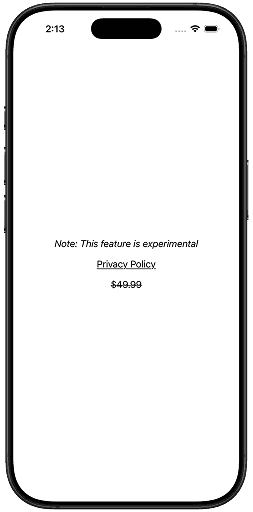
Italics, Underline and Strikethrough
You can further adjust the system font’s style by using modifiers such as .italic() to italicize the text, .underline() to add an underline, and .strikethrough() to draw a line through the text.
Example
VStack(spacing: 12) {
    Text("Note: This feature is experimental")
        .italic()

    Text("Privacy Policy")
        .underline()

    Text("$49.99")
        .strikethrough()
}
Output
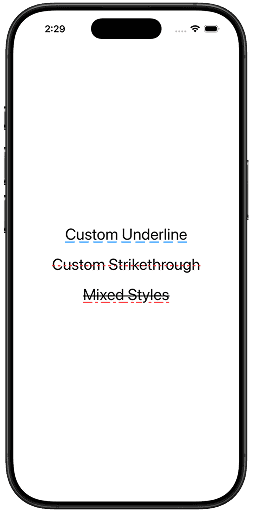
Starting with iOS 16, you can customize the .underline and .strikethrough by changing the line’s pattern and color. Pattern has these options: .dash, .dashDot, .dashDotDot, .dot,.solid.
Example
VStack(spacing: 12) {
    Text("Custom Underline")
        .underline(pattern: .dash, color: .blue)

    Text("Custom Strikethrough")
        .strikethrough(pattern: .dot, color: .red)

    Text("Mixed Styles")
        .underline(pattern: .dashDot, color: .red)
        .strikethrough(pattern: .solid)
}
.font(.title)
Output
Use Cases
.italic()- Quoting text, scientific names, subtitles or captions, thoughts or narration in text content.underline()- Links, key terms or definitions, items requiring user attention.strikethrough()- Completed tasks in a to-do list, Discounted prices, Deprecated or unavailable items
Letter Spacing: Kerning
Kerning adjusts the spacing between specific pairs of letters to improve visual balance and readability.
Example letter pairs:
- AV
- To
- Wa
Characteristics
- Applies to individual letter pairs
- Often handled automatically by the font
- Improves visual consistency, not uniform spacing
Example
VStack(spacing: 12) {
    Text("AV")

    Text("AV")
        .kerning(8)
}
.font(.title)
Output
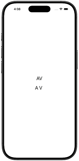
Use Cases
- Logos or branding text
- Headlines where visual polish matters
- Short strings of text
Letter Spacing: Tracking
Tracking adjusts the spacing uniformly across all letters in a word or block of text.
Characteristics
- Applies even spacing to all characters
- Often used for stylistic or readability purposes
- Affects the entire text range equally
Example
VStack(spacing: 12) {
    Text("WELCOME")

    Text("WELCOME")
        .tracking(8)
}
.font(.title)
Output
Use Cases
- All-caps text (improves readability)
- Buttons and labels
- UI headings
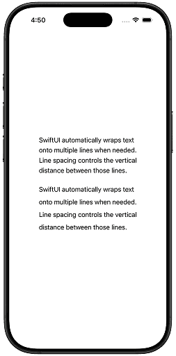
Line Spacing for Multiline Text
Line spacing is the distance from one line of text to the next.
- Default spacing is determined by the font
- Increasing spacing makes text easier to read
- Decreasing spacing makes text more compact
Example
VStack(spacing: 24) {
    Text("""
    SwiftUI automatically wraps text
    onto multiple lines when needed.
    Line spacing controls the vertical
    distance between those lines.
    """)

    Text("""
    SwiftUI automatically wraps text
    onto multiple lines when needed.
    Line spacing controls the vertical
    distance between those lines.
    """)
    .lineSpacing(8)
}
The value is measured in points and is added to the font’s default line height.
Output
Use Cases
- Body Text (Articles, Descriptions)
- Headlines with Subtext
- Compact UI Text
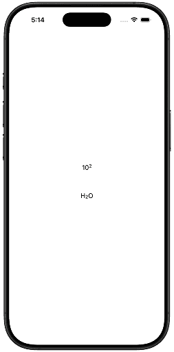
Baseline Offset
Baseline offset controls how text is shifted vertically relative to its baseline. The baseline is the invisible line on which most letters sit (like a, e, o), while letters such as g or y extend below it.
The .baselineOffset(_:) modifier lets you move text up or down without changing its font size or layout space.
What Does Baseline Offset Do?
- Positive values move text up
- Negative values move text down
- Measured in points
- Affects vertical alignment, not spacing
Example
VStack(spacing: 48) {
    HStack(spacing: .zero) {
        Text("10")

        Text("2")
            .font(.caption)
            .baselineOffset(8)
    }

    HStack(spacing: .zero) {
        Text("H")

        Text("2")
            .font(.caption)
            .baselineOffset(-6)

        Text("O")
    }
}
Output
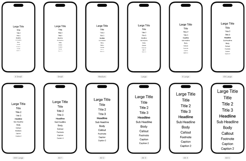
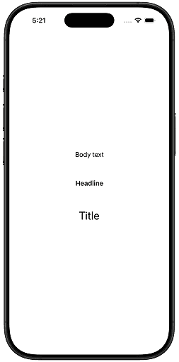
Supporting Dynamic Type (Accessibility)
Dynamic Type allows users to choose larger or smaller text sizes in iOS Accessibility settings. Supporting it properly ensures your app remains readable, usable, and inclusive for everyone.
System fonts is designed to work well with Dynamic Type by default—but there are important best practices to follow.
Use System Text Styles (Best Practice)
System text styles automatically scale with Dynamic Type.
Example
VStack(spacing: 48) {
    Text("Body text")
        .font(.body)

    Text("Headline")
        .font(.headline)

    Text("Title")
        .font(.title)
}- These fonts scale automatically
- Follow Apple’s typography guidelines
Output
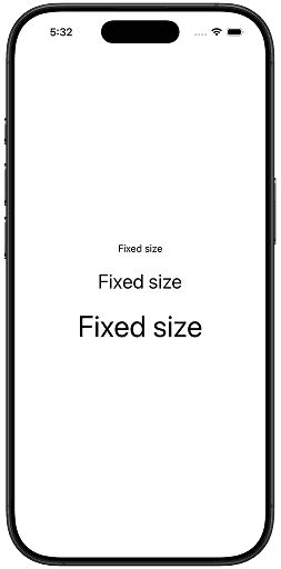
Avoid Fixed Font Sizes (When Possible)
Use system text styles whenever possible. Avoid fixed font sizes.
Example(Not Dynamic Type–friendly)
VStack(spacing: 24) {
    Text("Fixed size")
        .font(.system(size: 16))

    Text("Fixed size")
        .font(.system(size: 32))

    Text("Fixed size")
        .font(.system(size: 48))
}
Output
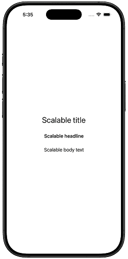
Example(Dynamic Type–friendly)
VStack(spacing: 24) {
    Text("Scalable title")
        .font(.title)

    Text("Scalable headline")
        .font(.headline)

    Text("Scalable body text")
        .font(.body)
}
Output
Conclusion
SwiftUI provides a typography system that is both powerful and opinionated. By using semantic system font styles, applying font modifiers intentionally, and respecting Dynamic Type and accessibility settings, you can create interfaces that remain readable, consistent, and adaptable across devices.
Custom fonts can be layered on top when branding requires it, but system fonts should remain the foundation for most user interfaces. Understanding how each font modifier affects text allows you to make precise typographic decisions while preserving accessibility and platform conventions. When used correctly, SwiftUI fonts help your UI communicate hierarchy, clarity, and intent without additional complexity.
If you have any suggestions, feel free to connect with me on X and send me a DM. If you enjoyed this article and would like to support me, Buy me a coffee.